Breakdown behind the scenes – Part 6 – Releasing the game

Sorry for the delay in posting this one, I’ve been on holiday and the Blogger website is blocked by my phone’s internet connection.

SPOILERS ALERT! If you’ve not played Breakdown yet go do so before reading these posts as they contain, amongst other things, a full walkthrough!

So finally I’m there! I’ve got a game I’m happy with, it has all the bits in it that I wanted (within reason) to put in and I’ve played it through a couple of times to make sure it’s all working and makes sense. It’s almost time to submit it, but there’s a few last touches. Hopefully I’ve stuck to my plan and still have a day or two left.

First I send the game to as many of my friends as I can convince to play it and look for bugs. It’s amazing how many spelling mistakes and grammatical errors you can miss in the scores of times you’ve played through different areas. Plus they don’t know the way AGS works and so they won’t be following the same rules you will. Example: In Alan Saves Christmas there’s a door that you need to get through, and in order to do that you need to solve a couple of rather difficult puzzles. I was surprised when one of my friends had managed to complete the game in about 10 minutes with no hints from me, and on questioning him further discovered that he had never solved either of these puzzles. He’d simply clicked on the wall near the door and Alan had walked straight through the door to the area behind it, sending him to the next room.

I also try and get my brother to play through the game, mainly because I can watch him doing it. Watching someone else play can be very eye-opening as they’ll try things you’d never have thought of. Sometimes they’ll do something you didn’t realise could happen and you’ll find bugs that they don’t even know are problems.

Also this is the point where you turn debug mode off. Actually I never use it for testing so I usually switch it off when I start the project, but it’s really easy to forget.

Fix any last problems and test your fixes thoroughly. Now it’s time to show off. I use IconArt by Conware to draw custom setup and exe icons, write massive manuals that hardly anyone reads, write even longer EULAs that nobody reads (these essentially boil down to “Don’t sell my game and don’t pretend that it’s yours”, but they’re kind of fun to write and give me some form of legal standing if I ever wanted to threaten anyone who was misusing my games). Upload the game to my website and create a page for it. Test the download. Mirror it somewhere. Test that download.

Now it’s time to tell the world about it. Generally I make a games database entry first so that I’ll have somewhere to link my posts to (also because I love getting feedback and seeing how many times the game’s been downloaded). Then there’s posts, almost simultaneously in the completed games and MAGS threads with everything cross-linked. That’s maybe a little overboard but I’ve just spent 25 days working on a game, I want people to play it!

Now it’s time to sit back and watch the comments coming in, hoping nobody finds a major bug in the first day. Oh, and this is also the time you promise yourself you’ll never do another time-limited game again.

Fin.
Breakdown behind the scenes – Part 5 – Pulling the game together

SPOILERS ALERT! If you’ve not played Breakdown yet go do so before reading these posts as they contain, amongst other things, a full walkthrough!

Everybody likes different bits of game making. Personally I love coding – coming up with a cool idea, putting in a rough implementation of it, thinking my way around all the possible problems, tweaking the code until it works just right and finally sitting back and seeing it working perfectly in game. This is the reason there is, for example, a fully working sliding door in the engine room corridor.

Unfortunately there’s another side to games called artwork. Pixeling a character can be fun, and I enjoy doing some animation (though not walkcycles, everybody hates doing walkcycles), but you can’t build a game without backgrounds and characters.

When it comes to putting the game together in AGS I focus on the areas I like doing (programming and writing) and do as much of those as I can until I have to draw the next bit of art. This way you can motivate yourself by thinking about all the great things you’ll be able to do once it’s finished.

With big things like backgrounds I also go through lots of versions. When I first start to put in walkable areas, walk-behinds and major hotspots I’ll have an accurate line drawing of a room. By the time I start to put in objects or do animation I’ll have at least coloured it in. Finally I’ll get fed up of looking at it in it’s half-finished state and put shading and texture in.

The same goes for the main character. When I’m just setting up rooms in AGS I only really need one standing graphic for the main character. When I’m testing walkable areas and putting in FaceLocation functions I’ll need all four directions. Finally I’ll get fed up of looking at them sliding around the floor and put in the walk animation… at least for one direction to start with.

Sometimes I do things that I don’t need yet, to avoid doing something more productive. For example the main character has a full set of speech animations. Later I decided to have them never speak, so none of them are ever seen in-game.

From this point it’s just a case of going through the cycle of Implement – Test – Improve until each piece of the game is at an acceptable level of quality.

I also try to work on sections of the game according to importance by dividing them into a set of categories:

Must be in the game
These are things that are vital, so the requirements of the competition must be met, major game breaking bugs must be fixed, the game has to be completable.

Really ought to be in the game
Almost vital things. All other game-breaking bugs need to be fixed, there should be a story or something to tell the player what they’re supposed to be doing. Walkcycles.

Nice to have in the game
These are the areas that start lifting your game out of the average. Nearly all bugs need to be fixed, everything that’s vital to completing the game should be put in and fully interactable and you should start adding in extra items/interactions that aren’t necessary but add to the atmosphere or humour of the game.

Would make the game really good
This is where I would start putting in sound effects, music, extra animation, title screens, cutscenes etc. Basically the icing on the cake. Masses of testing leading to 100% of bugs eliminated.

Would be awesome
Unfortunately this is where my plan to have loads of death sequences fell, so it never made it. Basically this category is where you put your ideas that realistically are never going to make it into the game (under the current time limit) but, if you were to discover you had an extra couple of days, you could put in.

In reality I don’t religiously stick to these boundaries because 1) I wouldn’t want to release something that wasn’t at least in the ‘Nice to have…’ category and 2) I have a habit of avoiding boring (and vital) parts of the game while I make something fancy and fun.

To be continued…

Breakdown behind the scenes – Part 4 – Layout

SPOILERS ALERT! If you’ve not played Breakdown yet go do so before reading these posts as they contain, amongst other things, a full walkthrough!

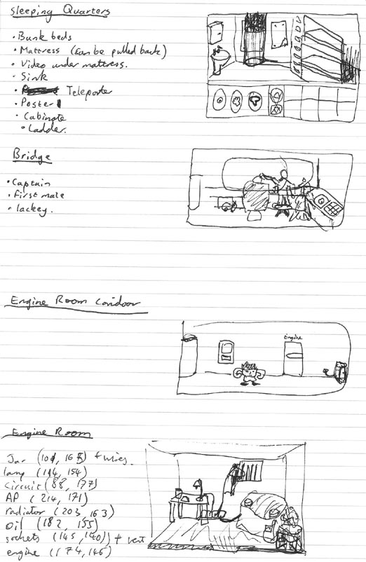
Now that I’ve got a complete set of puzzles and solutions, it’s time to work out where all those will physically fit into the game.

Of course the number and type of rooms needs to be considered during the puzzle writing stage. It’s very demotivating spending 6 hours working on the background to a room that’s only going to be used as a corridor to get to another room. Fortunately the way the puzzles and story panned out in Breakdown I only needed four ‘action’ rooms, and with a scifi setting I didn’t have to worry about access to those rooms because I could use a teleporter.

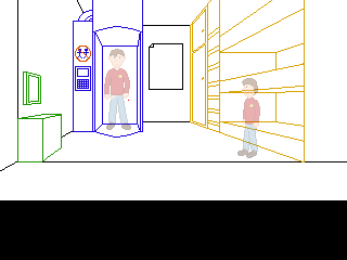
The picture above also shows some simple sketches of the physical layout of my four rooms. You need to fit all the major objects in while leaving room for the character to walk and interact with them. I try to avoid scrolling rooms because it’s already hard enough to make your background look interesting when you’ve got huge areas of single coloured wall or floor. There’s also a nice big user interface (work in progress in the top picture) to take up some more screen space. I hate drawing backgrounds.


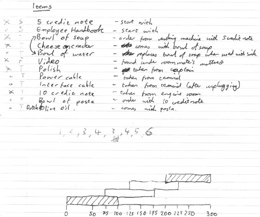
Before starting work on any backgrounds I also needed to design my GUI (Graphical User Interface). For instance, there’s no need to put in inventory scrolling arrows if the player’s never going to be able to pick up more items than there are slots. The picture above shows me working out the maximum number of inventory items that the player can have (and the overlapping bars are something to do with the timing of the automatic door in the engine room corridor).

By the way, we’re still on about day 5 or 6.

Once the GUI size has been decided, and therefore I know how tall each room needs to be, it’s time to start turning the very rough sketches into actual rooms. I used single point perspective to make everything accurate, which basically means the very first thing you do is draw the back wall of your room and pick a vanishing point on it. Everything is then drawn roughly using construction lines on a different layer, then converted to a detailed outline before being coloured and shaded/textured.


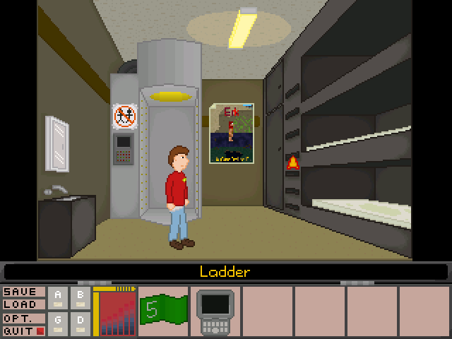
The AGS critics lounge is rather obsessed with single point perspective. If you submit a background for comments and criticism it’s almost certain somebody will start drawing red lines all over it telling you how the table doesn’t line up with the fridge. For the most part they’re right, and single point perspective is a good starting point to draw a fairly realistic background, but it does have it’s share of problems. Most noticeable of these is scaling. Unless you want scaling walkable areas in every single room (and I really don’t – I spent time carefully placing every pixel of that character to make him look as good as I could, I don’t want AGS taking a bunch of them out to draw him at a different size) your character is bound to look too small when they’re in the foreground and too big when they’re in the background. Take a look at the mirror above the sink on the left. It looks fine when the character is next to it because it lines up with his head, but it’s really far down the wall.

Every background in Breakdown is rigorously drawn to single point perspective rules. Every background except one where it really wasn’t working. Did you notice which one? Honestly? Sometimes it’s better to sacrifice realism to make something look better.

To be continued…

Breakdown behind the scenes – Part 3 – Puzzles

SPOILERS ALERT! If you’ve not played Breakdown yet go do so before reading these posts as they contain, amongst other things, a full walkthrough!

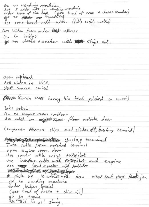
Now that I had a rough story I got a pad of paper and sat down for an hour or two working out all the puzzles and effectively writing a step-by-step walkthrough of the entire game. I’d say this is an almost essential step because it shows you exactly what you need to get done, and lets you see how far you are into the game’s development.

Neat handwriting is purely optional. This walkthrough also isn’t as detailed as it could be, the reason being that because the game is so short most of the design is in my head so this only has to act as a reminder of all the components and their order.

Puzzles are difficult things to come up with. The basic method I use to create them is to focus on the overall objective and come up with a series of tasks the player must complete, or obstacles they must overcome in order to get there. In Breakdown the objective is given in the MAGS rules – the ship cannot move and the player must repair something.

Ok, so lets say the player has to repair the ship’s engine. What could be wrong with the engine? Well, what things do you have to do to maintain a car engine? How about the radiator needs filling with water.

*Water + Engine = Repaired Engine.

That’s a little simple. Ok, where do we get the water from and how does the player transport the water to the engine?

*(Container) + Tap = Water in (Container)
*Water in (Container) + Engine = Repaired Engine

Where can we hide a tap? Well, how about in plain sight? Let’s put it right in front of the player in the first room they can interact with, the sleeping quarters, where it also makes logical sense. By the time they’ve discovered they need water, they’ll probably have forgotten all about it!

What about the bowl? Well, we could leave it lying around, but that would need somewhere logical for it to be like a kitchen or dining room. I can’t think of anything else I want to do with either of these rooms, so how about a food vending machine like they have on Red Dwarf? I can put that in any old corridor and it’ll add some character to life on the ship by making the player interact with background objects. What’s more If I can think up a use for another item of food I can make the player use the vending machine more than once so it seems less of a gimmick. How do I stop them ordering all the food at once though? By making the food cost money, and giving the player different amounts of money at different points in the game so that they can’t buy the wrong thing at the wrong time.

Suddenly something as simple as topping up the water level in an engine’s radiator has become

*Money + Vending Machine = Bowl of Soup
*Bowl of Soup + Tap = Bowl of Water
*Bowl of Water + Engine = Repaired Engine

Add to that a need to top up the oil level and the fact that you can’t even get to the engine in the first place, and you start to get an adventure game.

Some puzzles are born of necessity to make something more difficult, others are put in because they add character or make a good joke. I already mentioned the joke about the ship’s captain being bald (like Picard) and having his head polished. Suddenly I’ve got an opportunity for two puzzles – one in which the aim is to get the can of polish, and the other in which the solution involves a can of polish!

To be continued…

Breakdown behind the scenes – Part 2 – Characters and story

SPOILERS ALERT! If you’ve not played Breakdown yet go do so before reading these posts as they contain, amongst other things, a full walkthrough!

Continued from part 1…


Ethel (nameless at the time) was the first character I drew. Top tip – aliens are really easy to draw because you don’t have to worry about proportions. As I drew him I started coming up with a bit of backstory to add to his character, like him having a rubbish grade in some science subject that made him the most qualified crew member (and therefore rather full of himself). I also decided I wanted humans on the ship as well as aliens (and a human as the main character would be easier to relate to). Humans and aliens working together on a space ship? That’s a bit like Star Trek… Add a Star Trek-like shirt, badge and joke about lack of trousers and the game’s premise started to fall in place…


Norman was the next character. Another alien because they’re easier to draw and its easier to motivate yourself to draw hard things (like people) when you’ve already got other things done on the project. Different shirt colour because he’s a different type of officer, though I hadn’t decided what yet. I used contrasting ideas in his design, heavy-set and muscular, but very short, which lifts him from just being another background character. Meanwhile I started thinking about the Star Trek red-shirt – the extras who’s only purpose is to die instead of the main characters. What if the main character was a red shirt, sent in to do the dirty work because the other characters couldn’t be bothered?

(Another idea, which I would have loved to put in but got cut because I didn’t have the time, was that the ship would be filled with dangerous items. Doing certain things – trying to pick up sparking wires for example – would kill the player. However instead of the game ending like Sierra games used to, you’d get a new character – who looked identical to the original – taking over the quest and inheriting all the items you’d picked up. Kill yourself in enough different ways and you’d unlock a secret ending.)


A ship is nothing without its captain, so that was the next character I drew. Like every good parody captain he would appear to be strong and heroic, but never do any work (and he’d probably flee from the first sign of danger). Sticking with the Star Trek parody I made him bald and came up with a joke about him having his head polished by a subordinate. I liked this idea and raised it in the design from a background joke to a part of the game. Now all I had to do was come up with a good use for a can of polish…

To be continued…

Breakdown behind the scenes – Part 1 – Idea

SPOILERS ALERT! If you’ve not played Breakdown yet go do so before reading these posts as they contain, amongst other things, a full walkthrough!

“The theme of this month’s contest is a classic sci-fi setting – you must have your main character(s) on a ship afloat in space that is, for whatever reason, unable to move (other systems may be malfunctioning at the creator’s discretion). Are the characters scavenging the ship? Or is their own ship out of commission? The cause of the malfunction is up to the creator.”

It’d been a while since I’d entered a MAGS competition and, as is often the case when you already have a project on the go, I was feeling inspired to do something different. When SpacePirateCaine’s very open ruleset came along I decided to think up some possible games I could make to it.

My first plan was to do some kind of horror game, big on atmosphere. I’d love to do something serious that really grips the player, but ultimately decided I couldn’t pull it off in the time. Next idea was to return to my game-making roots and do something in an RPG Maker style – top down tiled graphics with a focus on exploring and environmental rather than inventory puzzles. Again another idea I’d love to return to in the furture, but some quick attempts at drawing tiles went badly and it would have been cheating to have used someone else’s free tileset.

I have a general rule of 5 days planning for MAGS. If I’m going to make a game in such a short amount of time I’ll need to know (more or less) what I have to draw, script, test and so on. So on the 5th of April (a Sunday) I had a last ditch attempt at coming up with a game idea and opened up Graphics Gale and started pixeling characters…

To be continued…