Some more practise with my graphics tablet, this time a little more constructive. Click the picture below for the full comic.
Tag Archives: art
Working Title
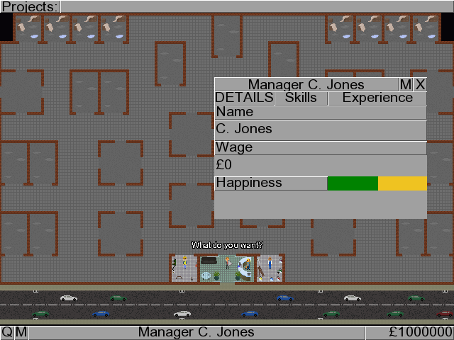
On a bit of a coding high at the moment… found and fixed several bugs in the aforementioned Mystery Project and implemented starting and naming projects. Here, have a screenshot and (working) title!

Don’t get too excited, there’s still an awful lot that needs programming and AGS could still come crashing to the ground with all I’m asking it to do… but its holding up remarkably well so far.
Work In Progress
Breakdown behind the scenes – Part 4 – Layout
SPOILERS ALERT! If you’ve not played Breakdown yet go do so before reading these posts as they contain, amongst other things, a full walkthrough!
Now that I’ve got a complete set of puzzles and solutions, it’s time to work out where all those will physically fit into the game.
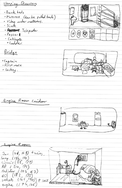
Of course the number and type of rooms needs to be considered during the puzzle writing stage. It’s very demotivating spending 6 hours working on the background to a room that’s only going to be used as a corridor to get to another room. Fortunately the way the puzzles and story panned out in Breakdown I only needed four ‘action’ rooms, and with a scifi setting I didn’t have to worry about access to those rooms because I could use a teleporter.
The picture above also shows some simple sketches of the physical layout of my four rooms. You need to fit all the major objects in while leaving room for the character to walk and interact with them. I try to avoid scrolling rooms because it’s already hard enough to make your background look interesting when you’ve got huge areas of single coloured wall or floor. There’s also a nice big user interface (work in progress in the top picture) to take up some more screen space. I hate drawing backgrounds.
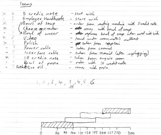
Before starting work on any backgrounds I also needed to design my GUI (Graphical User Interface). For instance, there’s no need to put in inventory scrolling arrows if the player’s never going to be able to pick up more items than there are slots. The picture above shows me working out the maximum number of inventory items that the player can have (and the overlapping bars are something to do with the timing of the automatic door in the engine room corridor).
By the way, we’re still on about day 5 or 6.
Once the GUI size has been decided, and therefore I know how tall each room needs to be, it’s time to start turning the very rough sketches into actual rooms. I used single point perspective to make everything accurate, which basically means the very first thing you do is draw the back wall of your room and pick a vanishing point on it. Everything is then drawn roughly using construction lines on a different layer, then converted to a detailed outline before being coloured and shaded/textured.
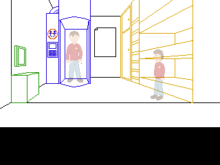
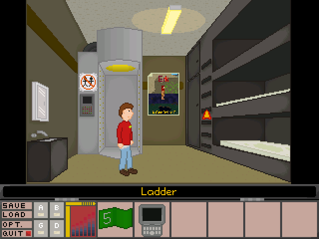
The AGS critics lounge is rather obsessed with single point perspective. If you submit a background for comments and criticism it’s almost certain somebody will start drawing red lines all over it telling you how the table doesn’t line up with the fridge. For the most part they’re right, and single point perspective is a good starting point to draw a fairly realistic background, but it does have it’s share of problems. Most noticeable of these is scaling. Unless you want scaling walkable areas in every single room (and I really don’t – I spent time carefully placing every pixel of that character to make him look as good as I could, I don’t want AGS taking a bunch of them out to draw him at a different size) your character is bound to look too small when they’re in the foreground and too big when they’re in the background. Take a look at the mirror above the sink on the left. It looks fine when the character is next to it because it lines up with his head, but it’s really far down the wall.
Every background in Breakdown is rigorously drawn to single point perspective rules. Every background except one where it really wasn’t working. Did you notice which one? Honestly? Sometimes it’s better to sacrifice realism to make something look better.
To be continued…
Breakdown behind the scenes – Part 2 – Characters and story
SPOILERS ALERT! If you’ve not played Breakdown yet go do so before reading these posts as they contain, amongst other things, a full walkthrough!
Continued from part 1…

Ethel (nameless at the time) was the first character I drew. Top tip – aliens are really easy to draw because you don’t have to worry about proportions. As I drew him I started coming up with a bit of backstory to add to his character, like him having a rubbish grade in some science subject that made him the most qualified crew member (and therefore rather full of himself). I also decided I wanted humans on the ship as well as aliens (and a human as the main character would be easier to relate to). Humans and aliens working together on a space ship? That’s a bit like Star Trek… Add a Star Trek-like shirt, badge and joke about lack of trousers and the game’s premise started to fall in place…

Norman was the next character. Another alien because they’re easier to draw and its easier to motivate yourself to draw hard things (like people) when you’ve already got other things done on the project. Different shirt colour because he’s a different type of officer, though I hadn’t decided what yet. I used contrasting ideas in his design, heavy-set and muscular, but very short, which lifts him from just being another background character. Meanwhile I started thinking about the Star Trek red-shirt – the extras who’s only purpose is to die instead of the main characters. What if the main character was a red shirt, sent in to do the dirty work because the other characters couldn’t be bothered?
(Another idea, which I would have loved to put in but got cut because I didn’t have the time, was that the ship would be filled with dangerous items. Doing certain things – trying to pick up sparking wires for example – would kill the player. However instead of the game ending like Sierra games used to, you’d get a new character – who looked identical to the original – taking over the quest and inheriting all the items you’d picked up. Kill yourself in enough different ways and you’d unlock a secret ending.)

A ship is nothing without its captain, so that was the next character I drew. Like every good parody captain he would appear to be strong and heroic, but never do any work (and he’d probably flee from the first sign of danger). Sticking with the Star Trek parody I made him bald and came up with a joke about him having his head polished by a subordinate. I liked this idea and raised it in the design from a background joke to a part of the game. Now all I had to do was come up with a good use for a can of polish…
To be continued…
Actually an art post
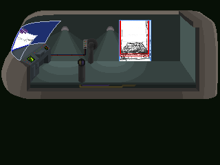
I’ve made the first entry to the art page by uploading some work I did for a now abandoned science fiction themed game. You can see the pictures and read a bit about them here.
I need to have a think about how I’m going to display pictures on my website, so far I’ve just been concentrating on getting the first few files uploaded.
Almost an art post
I was going to post some of the art I did for a now abandoned game tonight, but the lights have started dimming and I’d rather not lose my computer to a power surge… anyway, I’m now on a laptop without the files I need.
Stay tuned for the exciting conclusion tomorrow!
(maybe)
