SPOILERS ALERT! If you’ve not played Breakdown yet go do so before reading these posts as they contain, amongst other things, a full walkthrough!
Now that I’ve got a complete set of puzzles and solutions, it’s time to work out where all those will physically fit into the game.

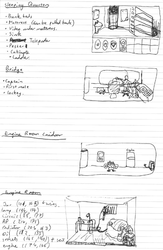
Of course the number and type of rooms needs to be considered during the puzzle writing stage. It’s very demotivating spending 6 hours working on the background to a room that’s only going to be used as a corridor to get to another room. Fortunately the way the puzzles and story panned out in Breakdown I only needed four ‘action’ rooms, and with a scifi setting I didn’t have to worry about access to those rooms because I could use a teleporter.
The picture above also shows some simple sketches of the physical layout of my four rooms. You need to fit all the major objects in while leaving room for the character to walk and interact with them. I try to avoid scrolling rooms because it’s already hard enough to make your background look interesting when you’ve got huge areas of single coloured wall or floor. There’s also a nice big user interface (work in progress in the top picture) to take up some more screen space. I hate drawing backgrounds.

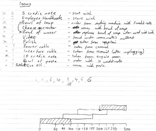
Before starting work on any backgrounds I also needed to design my GUI (Graphical User Interface). For instance, there’s no need to put in inventory scrolling arrows if the player’s never going to be able to pick up more items than there are slots. The picture above shows me working out the maximum number of inventory items that the player can have (and the overlapping bars are something to do with the timing of the automatic door in the engine room corridor).
By the way, we’re still on about day 5 or 6.
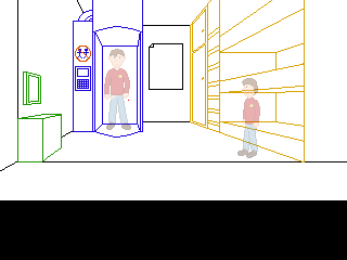
Once the GUI size has been decided, and therefore I know how tall each room needs to be, it’s time to start turning the very rough sketches into actual rooms. I used single point perspective to make everything accurate, which basically means the very first thing you do is draw the back wall of your room and pick a vanishing point on it. Everything is then drawn roughly using construction lines on a different layer, then converted to a detailed outline before being coloured and shaded/textured.


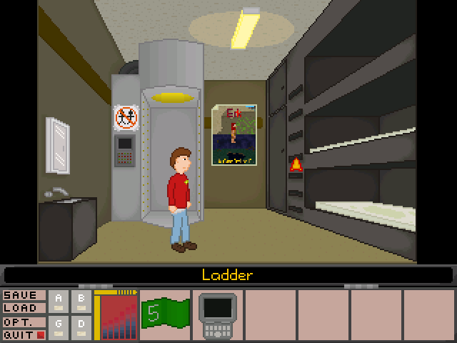
The AGS critics lounge is rather obsessed with single point perspective. If you submit a background for comments and criticism it’s almost certain somebody will start drawing red lines all over it telling you how the table doesn’t line up with the fridge. For the most part they’re right, and single point perspective is a good starting point to draw a fairly realistic background, but it does have it’s share of problems. Most noticeable of these is scaling. Unless you want scaling walkable areas in every single room (and I really don’t – I spent time carefully placing every pixel of that character to make him look as good as I could, I don’t want AGS taking a bunch of them out to draw him at a different size) your character is bound to look too small when they’re in the foreground and too big when they’re in the background. Take a look at the mirror above the sink on the left. It looks fine when the character is next to it because it lines up with his head, but it’s really far down the wall.
Every background in Breakdown is rigorously drawn to single point perspective rules. Every background except one where it really wasn’t working. Did you notice which one? Honestly? Sometimes it’s better to sacrifice realism to make something look better.
To be continued…
Hi, fantastic write-up!! I got you bookmarked. Cheers and best chooses